-
Architects: Peter Eisenman
- Year: 1975
-
Photographs:NJIT, sketchygrid.com
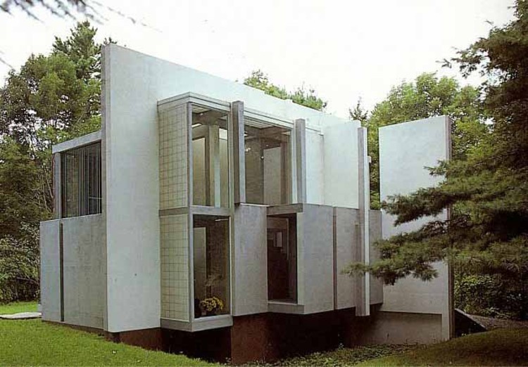
Text description provided by the architects. Unlike the previously featured Vanna Venturi House, Peter Eisenman's House VI includes disorientation in the work without the concept of relating it to the traditional home. The house is, in fact, anything but what one would consider a conventional house. Eisenman, one of the New York Five, designed the house for Mr. and Mrs. Richard Frank between 1972-1975 who found great admiration for the architect's work despite previously being known as a "paper architect" and theorist. By giving Eisenman a chance to put his theories to practice, one of the most famous, and difficult, houses emerged in the United States.

Situated on a flat site in Cornwall, Connecticut House VI stands its own ground as a sculpture in its surroundings. The design emerged from a conceptual process that began with a grid. Eisenman manipulated the grid in a way so that the house was divided into four sections and when completed the building itself could be a "record of the design process." Therefore structural elements, were revealed so that the construction process was evident, but not always understood.

Thus, the house became a study between the actual structure and architectural theory. The house was effeciently constructed using a simple post and beam system. However some columns or beams play no structural role and are incorporated to enhance the conceptual design. For example one column in the kitchen hovers over the kitchen table, not even touching the ground! In other spaces, beams meet but do not intersect, creating a cluster of supports. Robert Gutman wrote on the house saying, "most of these columns have no role in supporting the building planes, but are there, like the planes and the slits in the walls and ceilings that represent planes, to mark the geometry and rhythm of Eisenman's notational system."

The structure was incorporated into Eisenman's grid to convey the module that created the interior spaces with a series of planes that slipped through each other. Purposely ignoring the idea of form following function, Eisenman created spaces that were quirky and well-lit, but rather unconventional to live with. He made it difficult for the users so that they would have to grow accustom to the architecture and constantly be aware of it. For instance, in the bedroom there is a glass slot in the center of the wall continuing through the floor that divides the room in half, forcing there to be separate beds on either side of the room so that the couple was forced to sleep apart from each other.

Another curious aspect is an upside down staircase, the element which portrays the axis of the house and is painted red to draw attention. There are also many other difficult aspects that disrupt conventional living, such as the column hanging over the dinner table that separates diners and the single bathroom that is only accessible through a bedroom.

As annoying as the house was to inhabit, Eisenman was able to constantly remind the users of the architecture around them and how it affects their lives. He succeeded in building a structure that functioned both as a house and a work of art, but changing the priority of both so that function followed the art. He built a home where man was forced to live in a work of art, a sculpture, and according to the clients who enjoyed inhabiting Eisenman's artwork and poetry, the house was very successful.


